Item Properties
Items and their properties
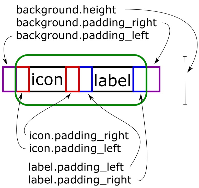
Items are the main building blocks of SketchyBar and can be configured in a number of ways. Items have the following basic structure:
Adding items to SketchyBar
sketchybar --add item <name> <position>
where the <name> should not contain whitespaces (or must be quoted), it is later used to refer to this item in the configuration.
The <position> is the placement in the bar and can be either left, right, center or q (which is left of the notch) and e (which is right of the notch).
The items will appear in the bar in the order in which they are added, but can be moved later on.
<name> | <string> |
|---|---|
<position> | left, right, center, (q, e #120) |
Changing item properties
sketchybar --set <name> <property>=<value> ... <property>=<value>
where the <name> is used to target the item.
(The <name> can be a regular expression inside of two slashed: /<regex>/)
A list of properties available to the set command is listed below (components might have additional properties, see the respective component section for them):
Geometry Properties
| <property> | <value> | default | description |
|---|---|---|---|
drawing | <boolean> | on | If the item should be drawn into the bar |
position | left, right, center | Position of the item in the bar | |
space | <positive_integer list> | 0 | Spaces to show this item on |
display | <positive_integer list>, active | 0 | Displays to show this item on |
ignore_association | <boolean> | off | Ignores all space / display associations while on |
y_offset | <integer> | 0 | Vertical offset applied to the item |
padding_left | <integer> | 0 | The padding applied left of the item |
padding_right | <integer> | 0 | The padding applied right of the item |
width | <positive_integer> or dynamic | dynamic | Makes the item use a fixed width given in points |
scroll_texts | <boolean> | off | Controls the automatic scroll of all items texts, which are truncated by the max_chars property |
blur_radius | <positive_integer> | 0 | The blur radius applied to the background of the item |
background.<background_property> | Items support all background properties |
Icon properties
| <property> | <value> | default | description |
|---|---|---|---|
icon | <string> | Icon of the item | |
icon.<text_property> | Icons support all text properties |
Label properties
| <property> | <value> | default | description |
|---|---|---|---|
label | <string> | Label of the item | |
label.<text_property> | Labels support all text properties |
Scripting properties
| <property> | <value> | default | description |
|---|---|---|---|
script | <path>, <string> | Script to run on an event | |
click_script | <path>, <string> | Script to run on a mouse click (Difference to mouse.clicked event: #109) | |
update_freq | <positive_integer> | 0 | Time in seconds between routine script executions (0 means never) |
updates | <boolean>, when_shown | on | If and when the item updates e.g. via script execution |
mach_helper | <string> | Registers a helper for direct event notifications (example) |
Text properties
| <text_property> | <value> | default | description |
|---|---|---|---|
drawing | <boolean> | on | If the text is rendered |
highlight | <boolean> | off | If the text uses the highlight_color or the regular color |
color | <argb_hex> | 0xffffffff | Color used to render the text |
highlight_color | <argb_hex> | 0xff000000 | Highlight color of the text (e.g. for active space icon |
padding_left | <integer> | 0 | Padding to the left of the text |
padding_right | <integer> | 0 | Padding to the right of the text |
y_offset | <integer> | 0 | Vertical offset applied to the text |
font | <family>:<type>:<size> | Hack Nerd Font:Bold:14.0 | The font to be used for the text |
font.family | <string> | Hack Nerd Font | The font family to be used for the text |
font.style | <string> | Bold | The font style to be used for the text |
font.size | <float> | 14.0 | The font size to be used for the text |
string | <string> | Sets the text to the specified string | |
scroll_duration | <positive_integer> | 100 | Sets the scroll speed of text trucated by max_chars on items with scroll_texts enabled |
max_chars | <positive_integer> | 0 | Sets the maximum characters to display (can be scrolled via the items scroll_texts property) |
width | <positive_integer> or dynamic | dynamic | Makes the text use a fixed width given in points |
align | center, left, right | left | Aligns the text in its container when it has a fixed width larger than the content width |
background.<background_property> | Texts support all background properties | ||
shadow.<shadow_property> | Texts support all shadow properties |
Background properties
| <background_property> | <value> | default | description |
|---|---|---|---|
drawing | <boolean> | off | If the background should be rendered |
color | <argb_hex> | 0x00000000 | Fill color of the background |
border_color | <argb_hex> | 0x00000000 | Color of the backgrounds border |
border_width | <positive_integer> | 0 | Width of the background border |
height | <positive_integer> | 0 | Overrides the height of the background |
corner_radius | <positive_integer> | 0 | Corner radius of the background |
padding_left | <integer> | 0 | Padding to the left of the background |
padding_right | <integer> | 0 | Padding to the right of the background |
y_offset | <integer> | 0 | Vertical offset applied to the background |
x_offset | <integer> | 0 | Horizontal offset applied to the background |
clip | <float> | 0.0 | By how much the background clips the bar (i.e. transparent holes in the bar) |
image | <path>, app.<bundle-id>, app.<name>, media.artwork | The image to display in the bar | |
image.<image_property> | Backgrounds support all image properties | ||
shadow.<shadow_property> | Backgrounds support all shadow properties |
Image properties
| <image_property> | <value> | default | description |
|---|---|---|---|
drawing | <boolean> | off | If the image should draw |
scale | <float> | 1.0 | The scale factor that should be applied to the image |
border_color | <argb_hex> | 0x00000000 | Color of the image border |
border_width | <positive_integer> | 0 | Width of the image border |
corner_radius | <positive_integer> | 0 | Corner radius of the image |
padding_left | <integer> | 0 | Padding to the left of the image |
padding_right | <integer> | 0 | Padding to the right of the image |
y_offset | <integer> | 0 | Vertical offset applied to the image |
string | <path>, app.<bundle-id>, app.<name>, media.artwork | The image to display in the bar | |
shadow.<shadow_property> | Images support all shadow properties |
Shadow properties
| <shadow_property> | <value> | default | description |
|---|---|---|---|
drawing | <boolean> | off | If the shadow should be drawn |
color | <argb_hex> | 0xff000000 | Color of the shadow |
angle | <positive_integer> | 30 | Angle of the shadow |
distance | <positive_integer> | 5 | Distance of the shadow |
Changing the default values for all further items
It is possible to change the defaults at every point in the configuration. All item created after changing the defaults will inherit these properties from the default item.
sketchybar --default <property>=<value> ... <property>=<value>
this works for all item properties.
Item Reordering
It is possible to reorder items by invoking
sketchybar --reorder <name> ... <name>
where a new order can be supplied for arbitrary items. Only the specified items get reordered, by swapping them around, everything else stays the same. E.g. if you want to swap two items simply call
sketchybar --reorder <item 1> <item 2>
Moving Items to specific positions
It is possible to move items and order them next to a reference item.
Move Item <name> to appear before item <reference name>:
sketchybar --move <name> before <reference name>
Move Item <name> to appear after item <reference name>:
sketchybar --move <name> after <reference name>
Item Cloning
It is possible to clone another item instead of adding a completely blank item
sketchybar --clone <parent name> <name> [optional: before/after]
the new item will inherit all properties of the parent item. The optional before and after modifiers can be used to move the item before, or after the parent, equivalently to a --move command.
Renaming Items
It is possible to rename any item. The new name should obviously not be in use by another item:
sketchybar --rename <old name> <new name>
Removing Items
It is possible to remove any item by invoking, the item will be completely destroyed and removed from brackets
sketchybar --remove <name>
the <name> can again be a regex: /<regex>/.